Starbucks Guide
Creating a more inclusive Starbucks experience
CONTEXT
An initiative project on which my friend and I collaborated to address the inclusivity issue we discovered in new Starbucks customers.
TIMELINE
3 months
ROLE
UX Designer & Researcher
TOOL
Figma
PLATFORM
Mobile
OUTPUT
Utilizing service design theory, we created a scannable website to fill the information gaps we discovered with new customers of Starbucks.
LET’S PAUSE
Do you remember your first Starbucks experience? Or your first time visiting a coffee shop? How was it? Although it appears to be simple, many people believe otherwise.
BACKGROUND
I discovered the issue from a once-viral tweet, “Cara memesan kopi di Starbucks (How to order coffee at Starbucks),” which received a lot of engagement (unfortunately, I couldn’t find the thread anymore because it’d been deleted by the user, but the tweet received over 25K likes and thousands of quote retweets). Fortunately, I can still track the replies on Twitter. Here’s some of the replies:
RESEARCH (1/5)
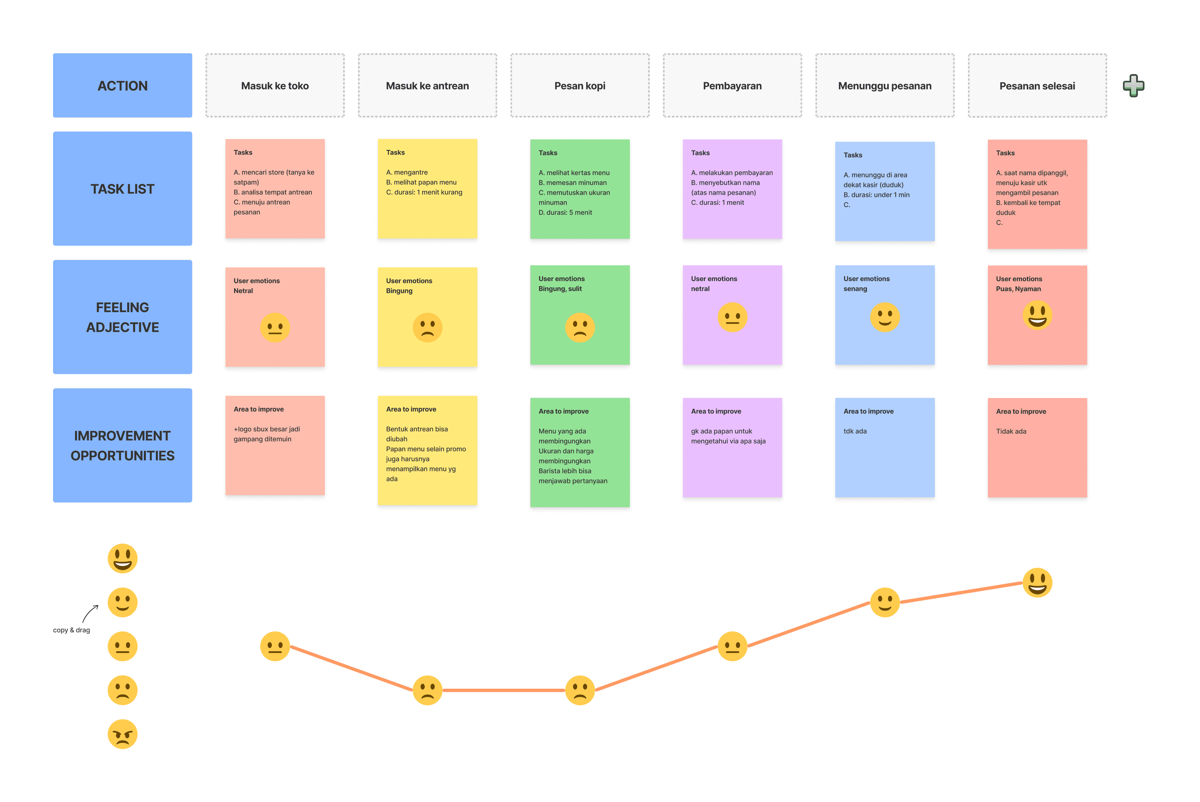
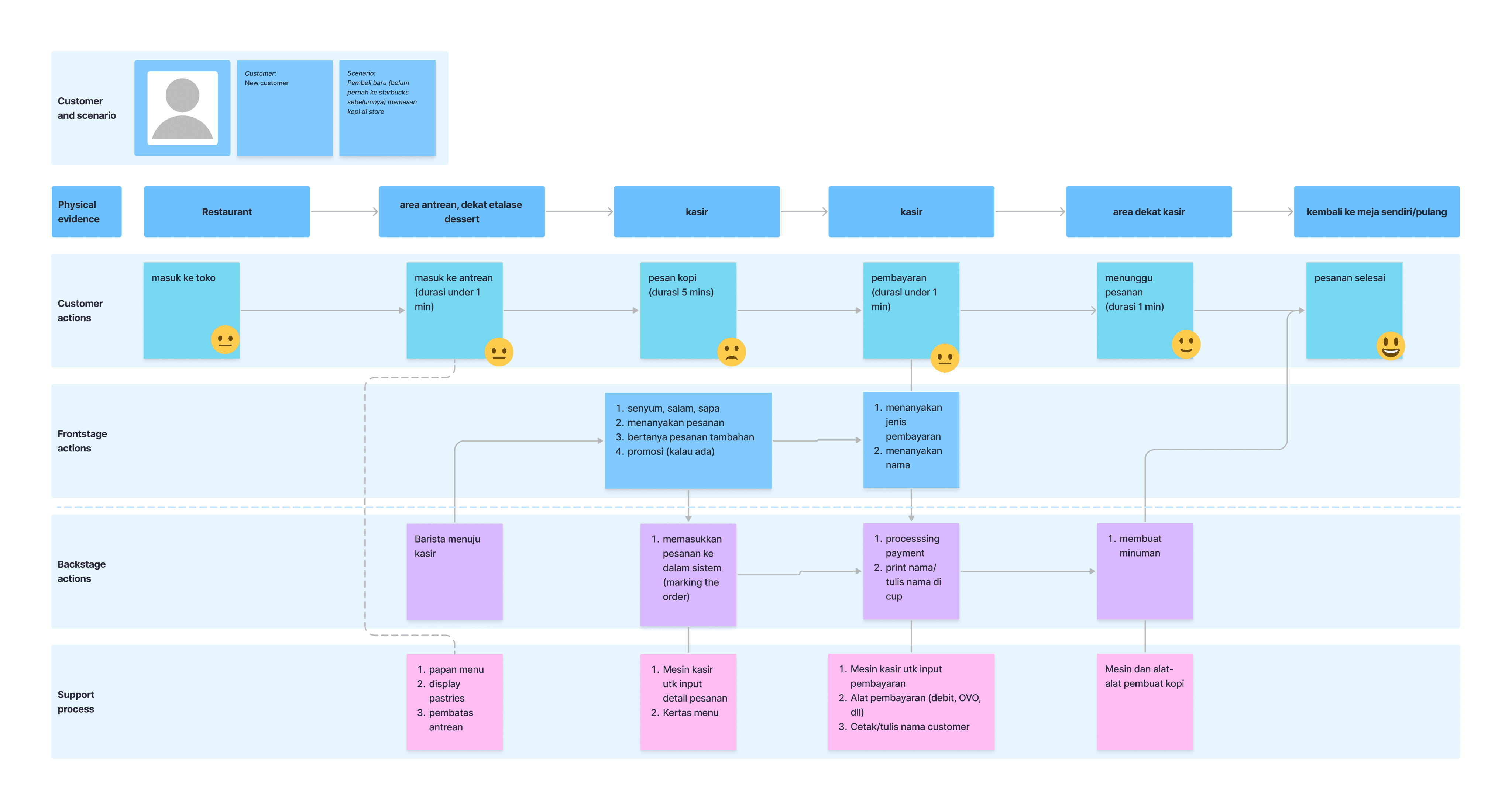
My friend Mahesa and I believed using Service Design method will be beneficial to understand this issue since we could see the problem from several touchpoints.
After synthesizing the research data, we got two deliverables:
User Journey Map and Service Blueprint.
Then we cross-checked our hypotheses against the findings, which led to our final problem statement.
PROBLEM STATEMENT
“How Might We provide necessary information that is easy to understand by new customers, so their first ordering experience is more enjoyable?”
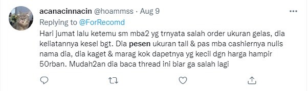
"Last Friday, I met a woman who appeared to be very upset because she had ordered the wrong size of beverage. She ordered a tall size and when the barista was writing her name on the cup she was very upset because, in her opinion, the cup was too small...."
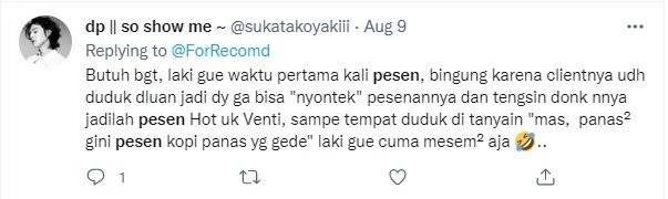
“My clueless husband, trying to ‘copy’ his client's order but the person has already sit to their table. In the end he ordered a Venti-sized hot beverage, a huge hot coffee in a hot weather. When his client mentioned that, he felt so embarrassed...”
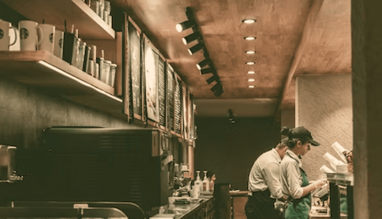
We did a service safari by visiting a Starbucks store.
We also interviewed a barista to gain more knowledge.
HYPOTHESES:
The barista was unhelpful to the customers.
FINDINGS:
Most baristas were eager to assist customers and followed SOP for greeting and smiling at customers.
HYPOTHESES:
Unfamiliar menus.
FINDINGS:
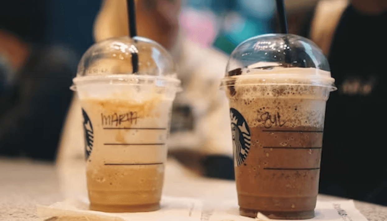
Not only are customers confused about different kind of coffees, but they are also confused about the names of the different cup sizes (Trenta, Grande, etc.), and the additional items (milk, etc.), which can be overwhelming for new customers.

HYPOTHESES:
The waiting line is not a problem.
FINDINGS:
Because new customers are overwhelmed with new information, they are hesitant to ask questions for fear of making the line longer or of being judged by others if their questions appear stupid.
IDEATION (2/5)
We had several good ideas that we could put into action, but after prioritizing them, we decided to create a scannable Starbucks' new customer guide website that customers could scan from QR code at various points throughout the store. This solution is actually very supported by the fact that we discovered during the immersion phase, where we found that many people in unfamiliar situations would first analyze their surroundings to make themselves more prepared for the situation.
Here are some principles that helped us design the solution:
Inclusive to new customers (first-timer)

Clear and concise information
Match between system and real world
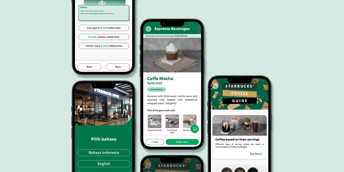
FINAL DESIGN (3/5)
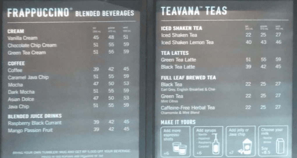
The Starbucks guide will have necessary information: Starbucks menu, size guide, coffee guide, payment and order guide. We added several features as well, such as promos, quiz, and simulation.
We had the idea to revise the menu page with more information after seeing the actual menu in the store and the menu on the Starbucks app, which we believe is more appropriate for people who already know what they want to buy. Meanwhile, most new customers will have no idea what a Freddo or a Frappuccino is.
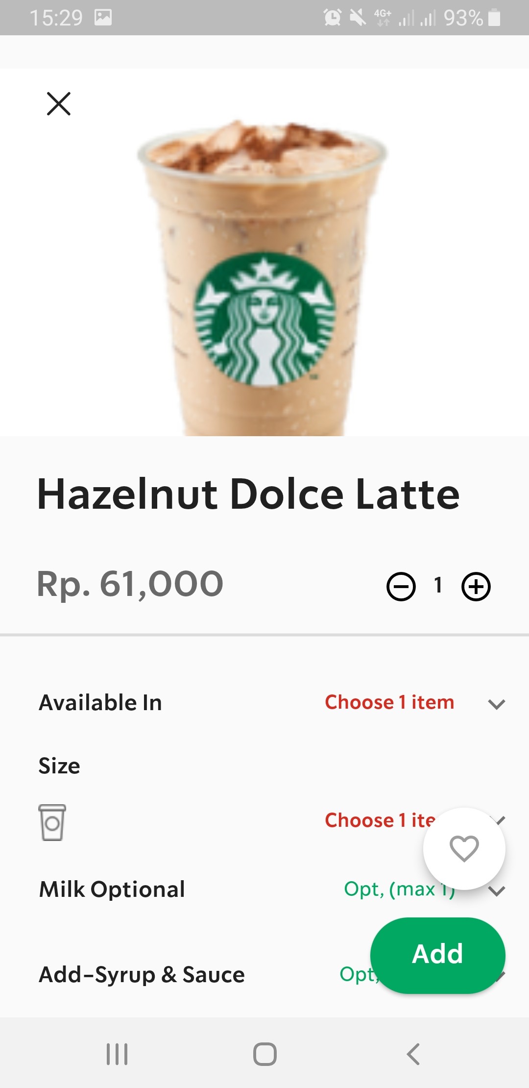
STARBUCKS MENU
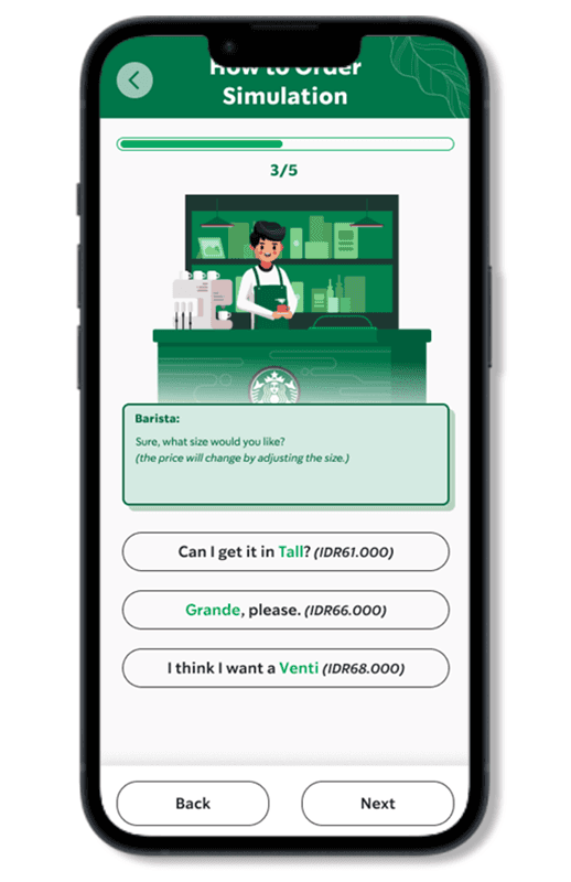
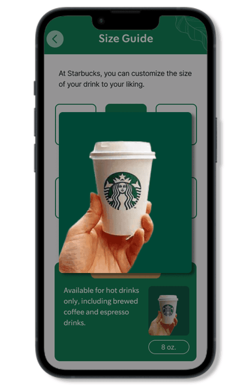
SIZE GUIDE
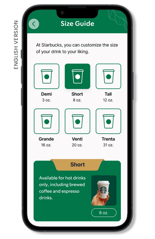
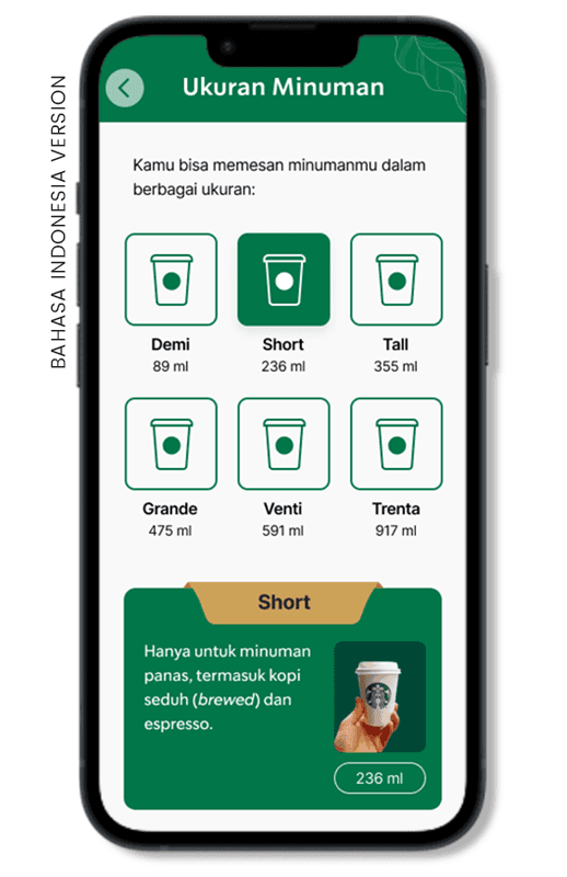
According to the desk research and user interviews, one of the most frequently mentioned issues that new customers encountered was how Starbucks names their cup sizes uniquely. Knowing how important branding is to Starbucks (based on our barista interview), we did not intend to change their naming; instead, we added a section where we provide the cup size information.
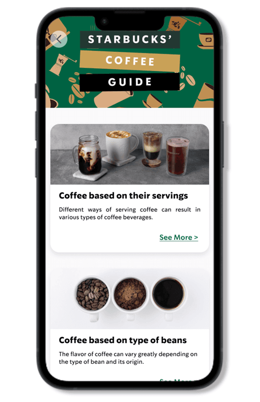
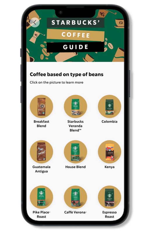
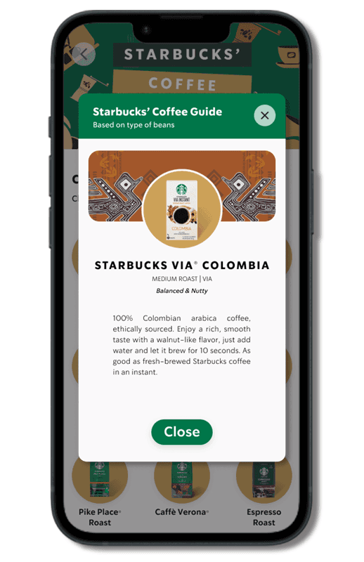
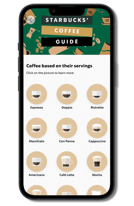
COFFEE GUIDE
We created a coffee guide after we realized that the description on the menu, even though it’s written in short text, should be written in a language that makes the product ‘marketable’. So, we created another section, a coffee guide, to explain the menu in a more ‘straightforward’ language. We put another non-menu information as well that we think will be very essential for a new customer who has just begun their coffee journey.
Board menu and menu on app have minimum information
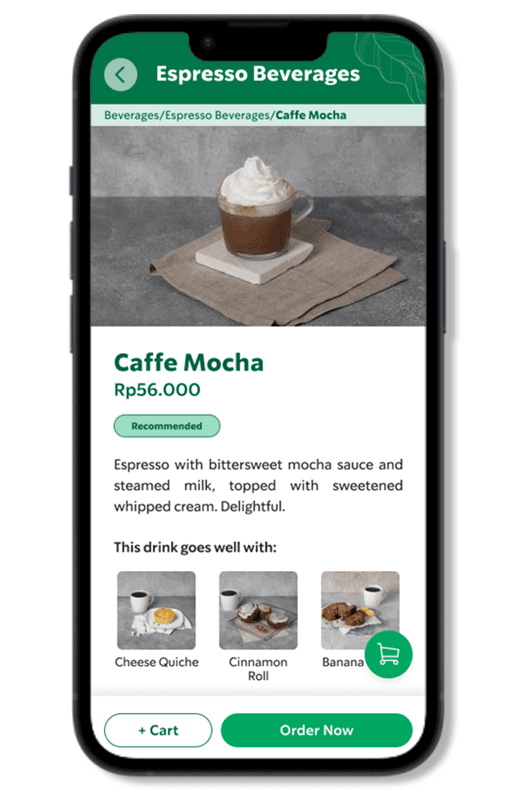
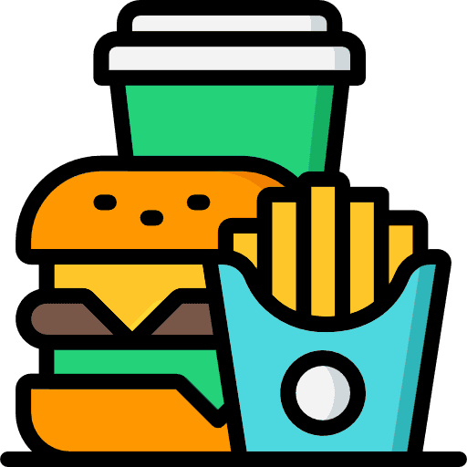
food pairings
This feature suggests the best foods that pair well with the beverages. I got the inspiration to put this feature by how a barista would suggest the other menu when a customer was ordering something as a way to upsell the product.
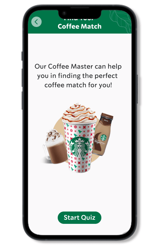
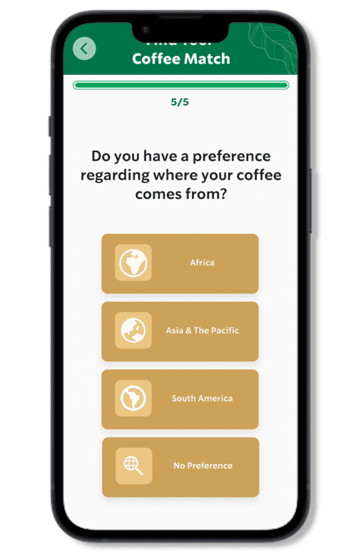
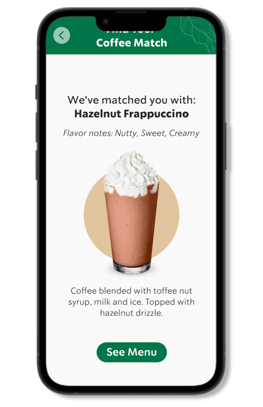
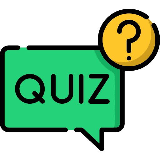
quiz
We believe that this feature will be useful for people who want to try new beverages recommended by the system (quiz). The result page will direct customers to the menu page, making it easier for them to place an order if they want to buy it.
inclusivity
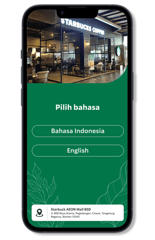
To make the design more inclusive, the users can access the website in two languages: Bahasa Indonesia and English. Aside from the menu description copy, we added a small detail that we believe will be useful to users: we used different metric scales for the size guide. We used Oz or ounce to describe the volume of the cup for English speakers. Meanwhile, for Bahasa Indonesia speakers, we converted it to milliliters because Indonesians are more familiar with and use this metric on a daily basis.
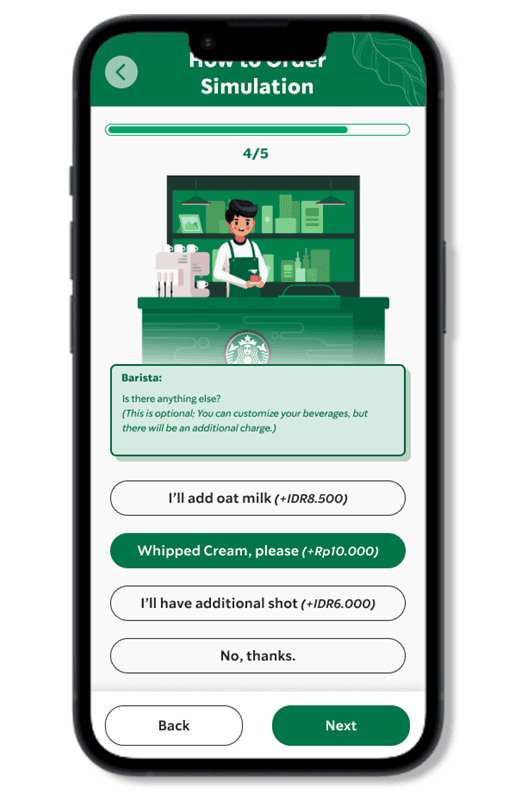
simulation
We took the concept from visual games and developed a new simulation game in which players take on the role of a Starbucks customer and interact with a barista in a manner similar to what they would encounter when ordering a Starbucks beverage in real life.
Starbucks mobile app order flow
Select store
Browse menu
Pay
Order Complete
(pickup)
This design order flow
Browse Menu
Order
Go to cashier
Pay
Order Complete
no interaction with staff, more suitable for familiar user
still has human interaction that align with the brand’s principles
Starbucks store order flow
Go to cashier
Order
Pay
Order Complete
ORDER FLOW & BUSINESS FLOW
Aside from the design principles we use when developing the design, we also put the business metrics in mind. For Starbucks, I believe the end goal should be sales, so here are a few design or feature ideas to support that metric:
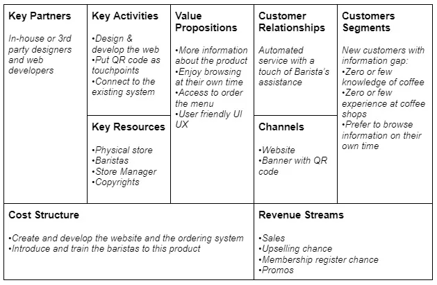
We summarize how the revenue flow works in this Business Model Canvas:
In contrast to the current Starbucks app, we've designed a different order flow to enhance customer interaction with the baristas. While the existing app allows direct payment and pickup, our approach incorporates interaction by having the QR code scan order data only, with payment processed at the cashier.
This maintains the importance of customer interaction while letting new customers access information beforehand. This may look inefficient compared to the flow on the existing app, but we believe this flow allows new customers to engage in their own Starbucks’ experience, which will lead into customer loyalty in the long term.
Guide and quiz pages has a direct CTA to order page
Quiz result page has share button to social media
Beverages menu has food suggestion to increase upselling
SCOPE AND LEARNINGS (5/5)
PROJECT SCOPES & LIMITATIONS
The project’s scope includes developing a design that assists new Starbucks customers in understanding the menu, sizes, payment options, and other information related to their ordering experience.
Because the research is more focused on the issue occurring in Indonesia and all of the participants are Indonesian, the solution we proposed may be more relevant to people in Indonesia or be implemented in Starbucks Indonesia stores. Outside of this context, users’ perceptions, beliefs, and opinions may differ.
This project is subject to legal or regulatory constraints. By not sharing private information here, we honor the company’s policy and the non-disclosure agreement.
LEARNINGS
When I hear the word inclusivity, as a new designer, I immediately think of big things like designing for people with special needs, designing in different languages, and so on. The process of carrying out this project taught me that being inclusive means being more engaging to everyone, whether it’s a single mother with children, people who are shy of public attention, or even small birds you meet at the park. The goal of inclusivity is to break down barriers so that everyone can feel like they belong.
While users are important, when designing, it's also crucial to consider both the business and technical aspects of the solution.
FUTURE RECOMMENDATIONS
More accurate quiz result. The current quiz, “Find your coffee match,” will only provide you with a template result. This could be improved to be more accurate, but we believe it will take more time to implement additional research because we need to analyze every flavor note of every beverage to truly match the question.
Enhance the menu description. We believe that the current menu copy can be improved by using more descriptive copy for each beverage’s flavor note. But, once again, there was a time constraint, so we decided not to pursue this path.
Let's transform your ideas!

VALIDATION AND ITERATION (4/5)
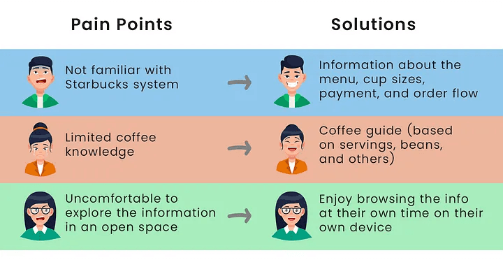
We tested our design to three participants. They believe the design will address the gap that is commonly encountered with new customers. They are also very impressed with the food pairing feature. Here are the user pain points that this design addressed:
As for the iteration, we addressed a few minor issues, including the visibility of the search bar and the visibility of some images in the size guide.